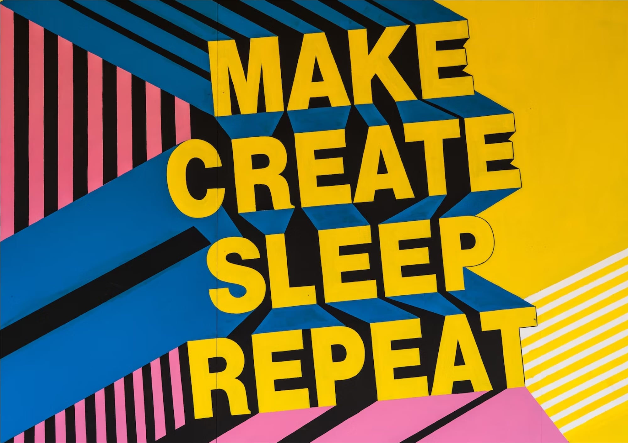
Typography in Designs: Why Fonts Aren’t Just Fonts
Typography is more than picking a pretty font — it’s the voice of your design. Imagine a law firm using the same font as a kids’ birthday invitation… doesn’t feel right, does it? Fonts carry emotion, personality, and purpose.
1. Set the Tone
Bold sans-serifs shout confidence. Elegant serifs whisper professionalism. Handwritten styles? They tell your audience you’re “creative, but approachable.”
2. Hierarchy Matters
Good typography guides the eye. Headlines grab attention, subheadings give structure, and body text keeps things readable (please, no10px size).
3. Less is More
Mixing too many fonts is like wearing polka dots, stripes, and plaid all at once. Stick to 2–3 families max — your readers will thank you.
4. Test Everywhere
What looks amazing on your MacBook might look tragic on a phone screen. Always check legibility across devices.
Final Thought
Typography is design’s quiet hero. It doesn’t scream for attention, but it shapes how people feel and interact with your brand. At Boring Studio, we make sure your fonts don’t just look good — they say the right thing, in the right way.